When A Replica Becomes A Bone Of Contention
Images: Branko Radovinovic
Many people spent many hours to recreate this long, lost prototype and it feels easy to criticize the hard work from the comfort of the enthusiast’s armchair. However, there will still only be one original and the Polo Storico replica, however labour-consuming, will always remain a replica.
It is important to note differences to conserve the design purity of the original and to not let history be rewritten by the replica.
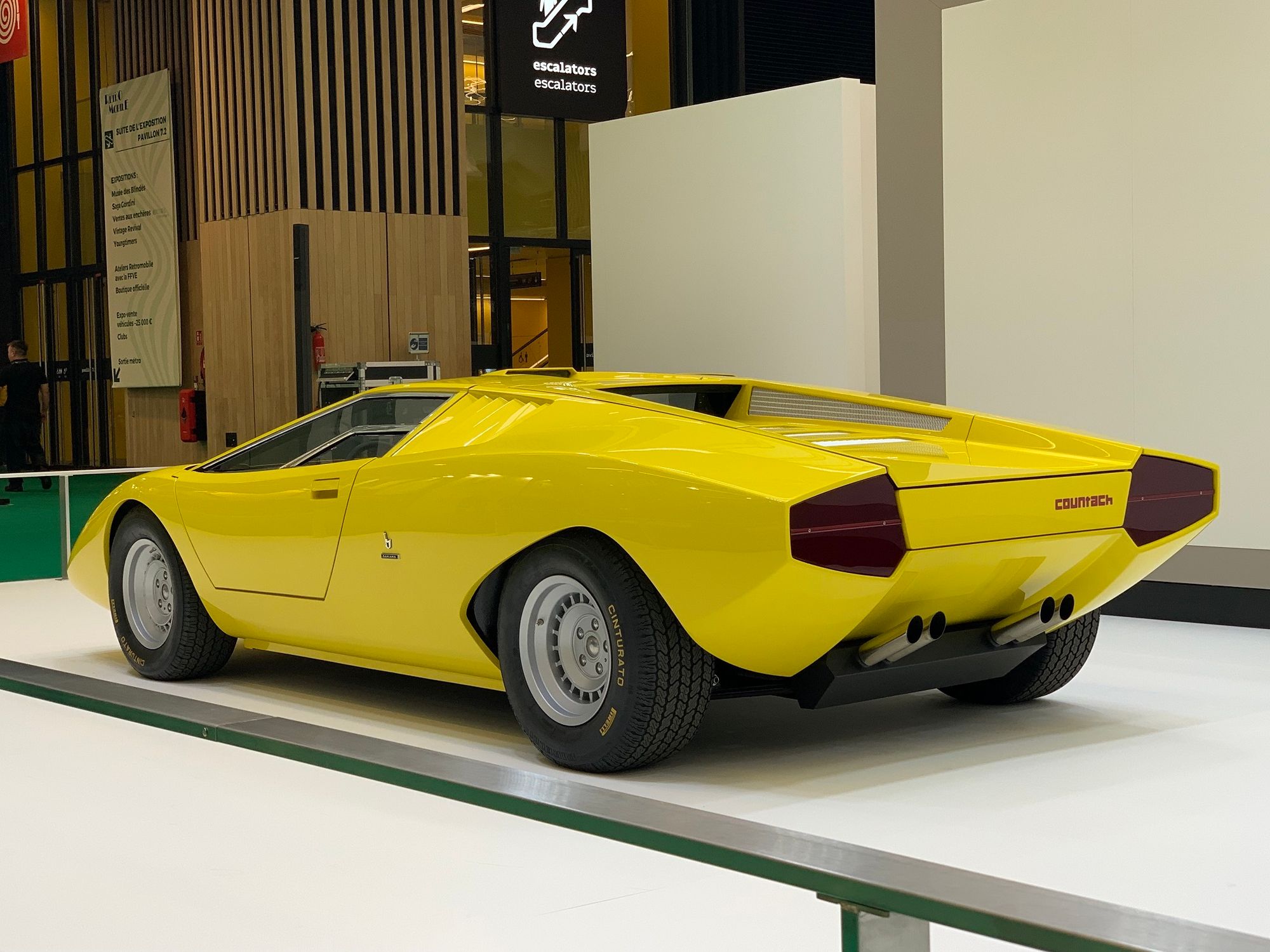
The new LP500 looks fantastic, but the longer you compare it to period pictures of the 1971 model, the more differences you can spot. Some of these are in my opinion fundamental to the completeness of the design concept. Very small variations of the same elements can make for quite a difference.
A bit like two sisters who look very alike, but one wouldn’t turn any heads and the other is a beauty queen. Or the difference between the Alfa Montreal concept shown in 1967 at the Expo and the Alfa Montreal at the local dealership in 1970, to keep the analogy in automotive terms.
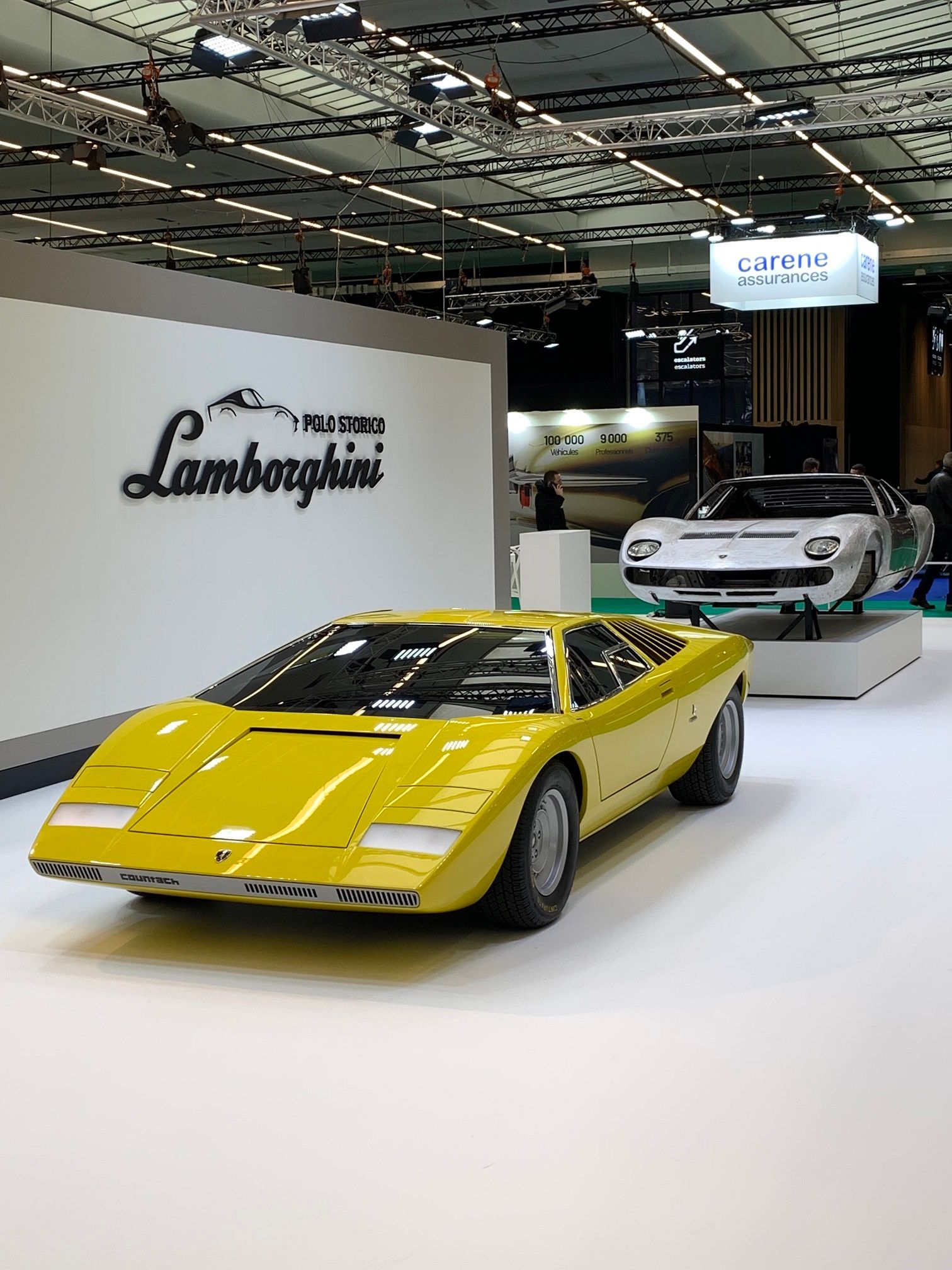
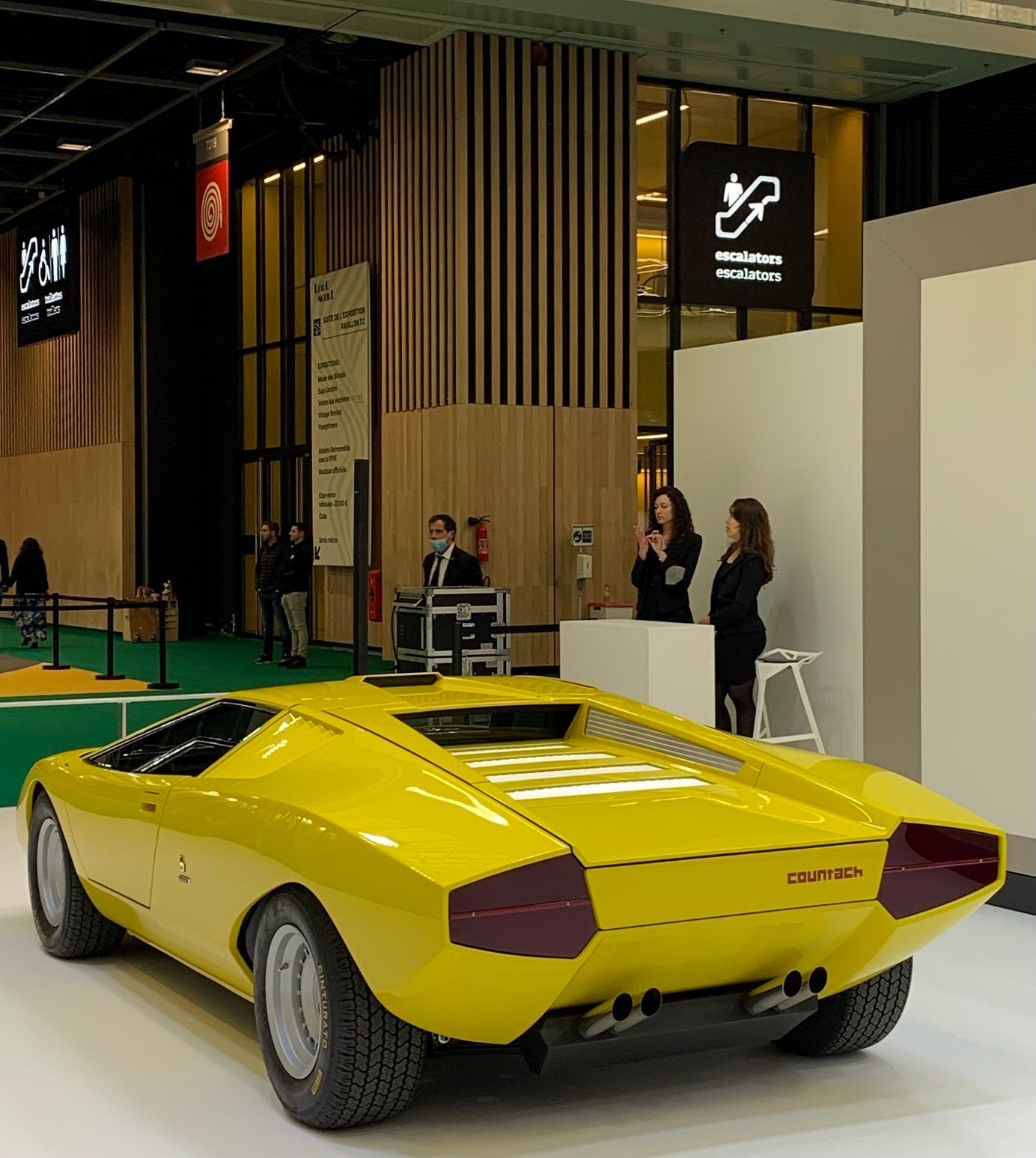
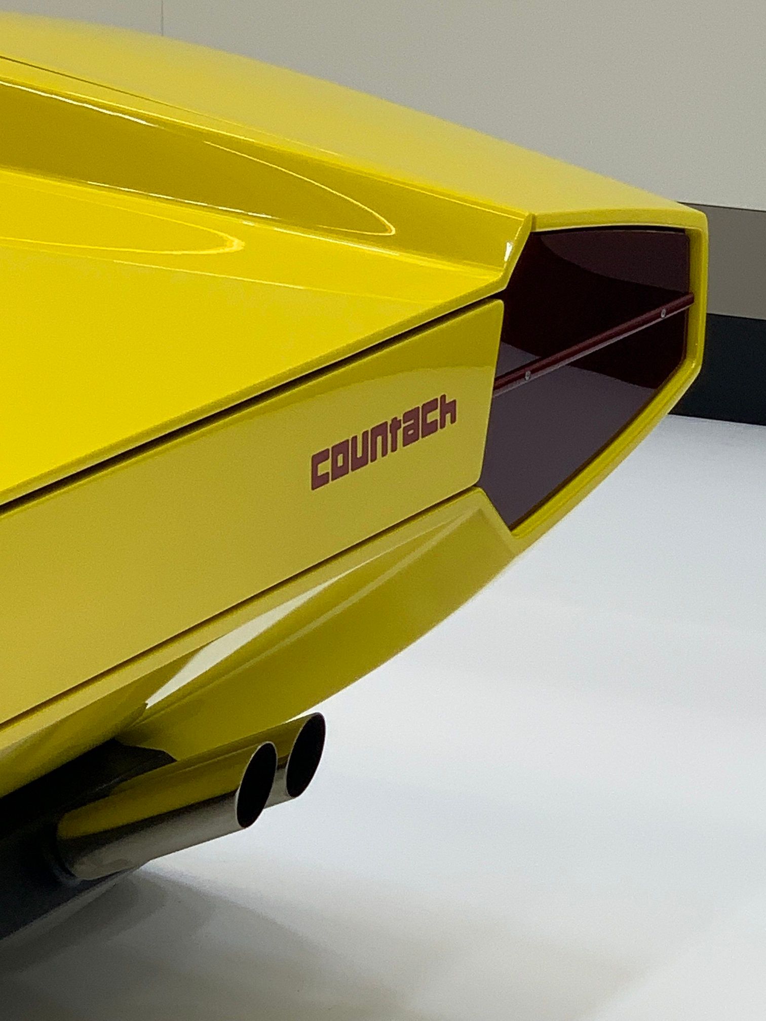
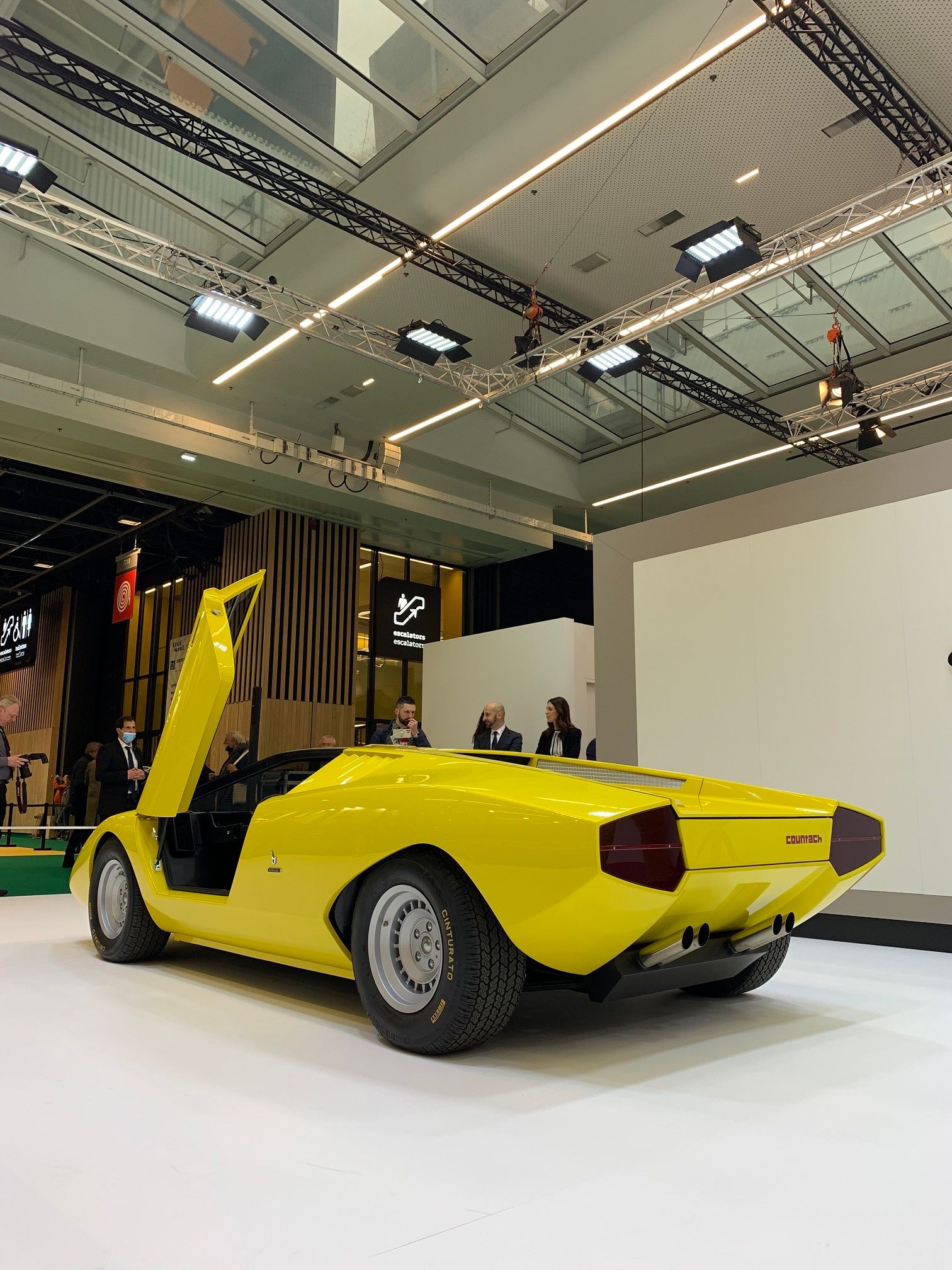
Let’s focus on the side profile. The most obvious modification is the addition of the mysterious chassis side-skirt. It jumps in the eye immediately, since it is painted in the same bright yellow colour as the rest of the car. Unlike the original which has the body gently sweeping inwards, towards the underside of the body, these skirts prevent that visually from happening.
This also covers up a bit of the fact that the body itself seems to tuck in less than the original. (I hope it is clear what I mean with this: there is a sharp crease between the wheel centres; above this line the surface is nearly vertical; below this line the surface comes inwards towards the underside of the car. The gradient by which this happens is less on the new one).
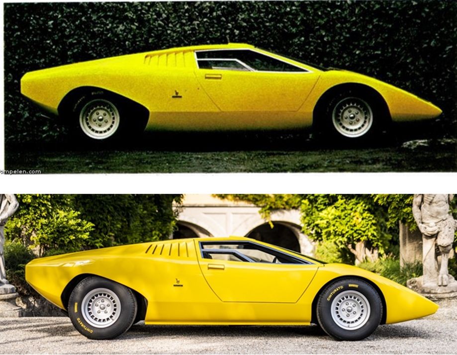
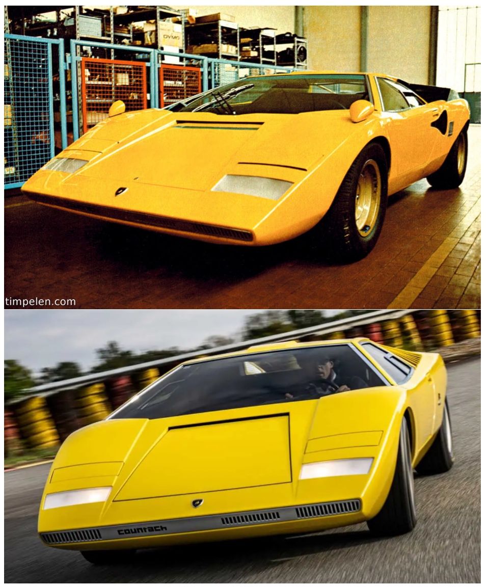
One of the main expressions of the unibody design of the original Countach is the sweeping, wrap-under side-skirt. The sharp line between the wheel centres of the original does not stand on itself but comes from the nose. Part of the design language has been lost in translation at this point. It is very clear that an LP400 nose has been used and not the sharper, leaner LP500 nose section.
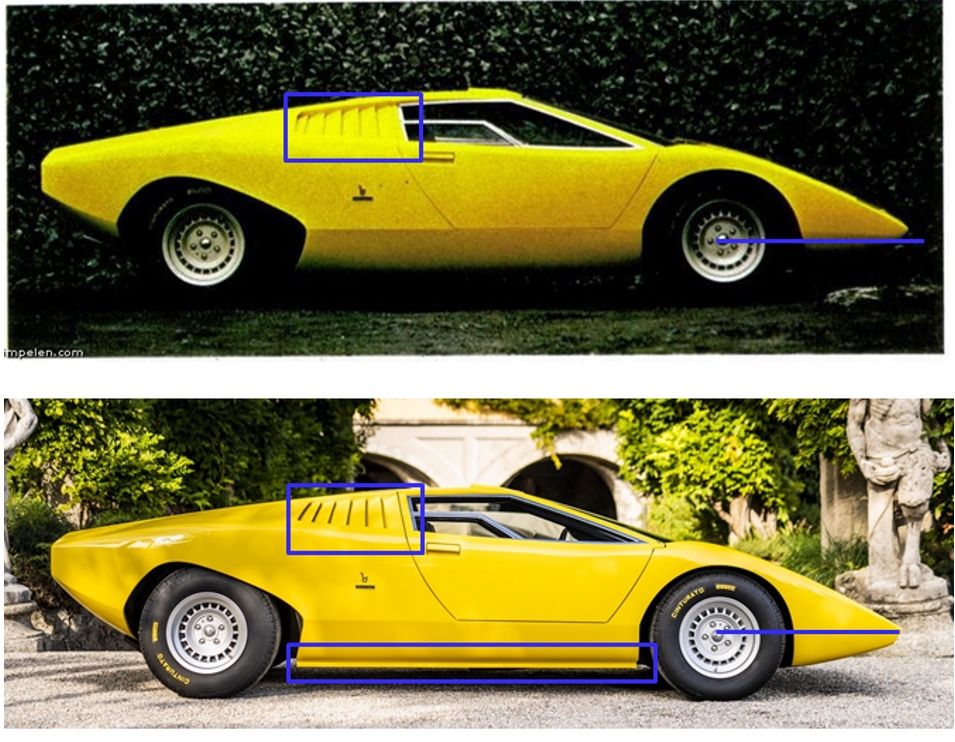
The coordination between these lines is lost because it is absent in the replica, but let’s draw it anyway in blue where it should have been on the images below to clarify the point.
Although the picture of the original is a bit dark, it shows that below that line there is almost no bodywork, yet there is quite some left on the replica. The absence of the creased line (wheel centre – nose) makes the front section of the recreation look even more rounded and ‘heavier’ to the eye.
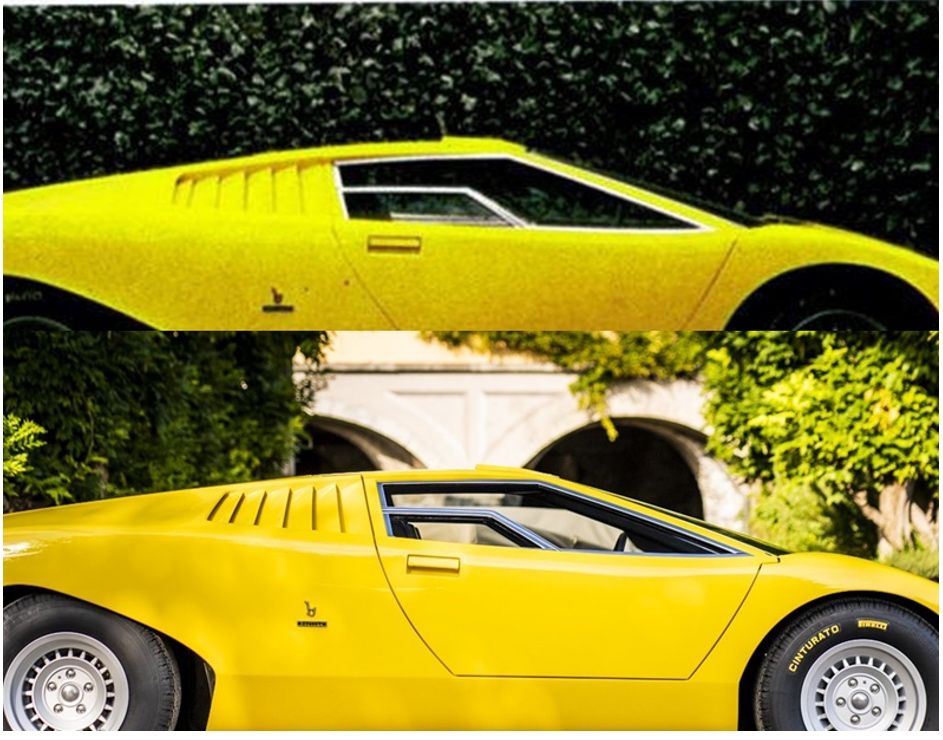
The cooling louvres are another area of contention for me. The original has quite vertical, slightly varying louvres which open only very little (hence the non-existent cooling). From a bit further away, these louvres look like a covered-up part of the cockpit glass-area.
There is a unity between these elements and the glass area as part of the same surface or shape. The outline is clear, and the louvres are contained within the shape. Note the rear part, it is almost vertical. It is essentially a miniature version of the total car!
The Kamm-tail and arrow point nose are reflected in the glass-and-louvres area. Genius design by the maestro here!
The design of the replica is much more difficult to read in this area. The outline shape is less pronounced and shaped differently. The rear part here is under quite an angle with the bottom point a lot further back than the roof point (sadly, we lose the mimicking of the Kamm-tail here...).
This could be a lighting issue, but it seems to me that the louvres of the original are recessed a bit more. This would allow to better make the connection with the shape of the glass area.
The angles between the louvres vary a lot more from the first to the second, second to the third, and so on. It introduces a sort of waviness or unrest; whereas in the original it was a point of overall coherence. The opening apertures seem to be larger as well, especially of the first one.
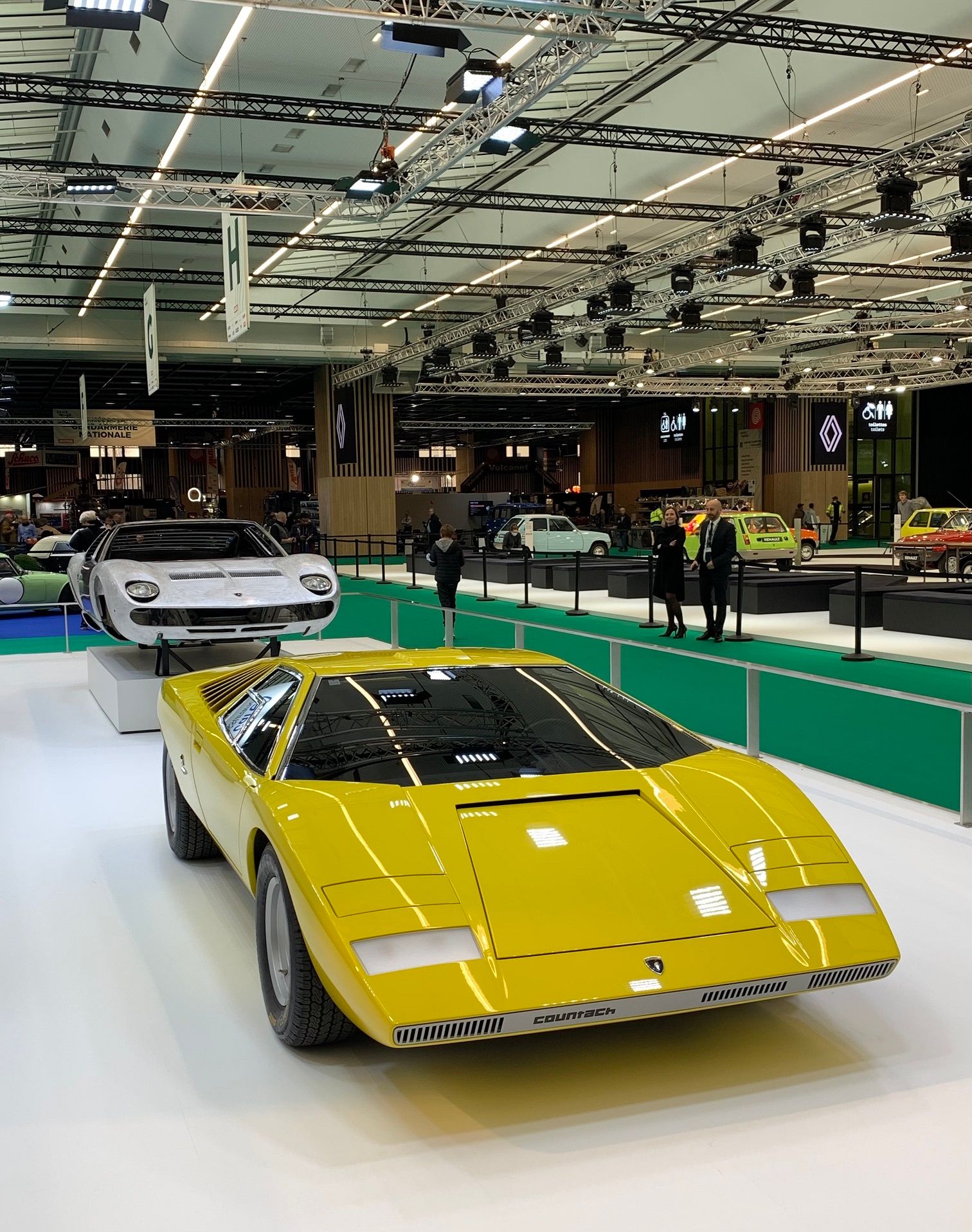
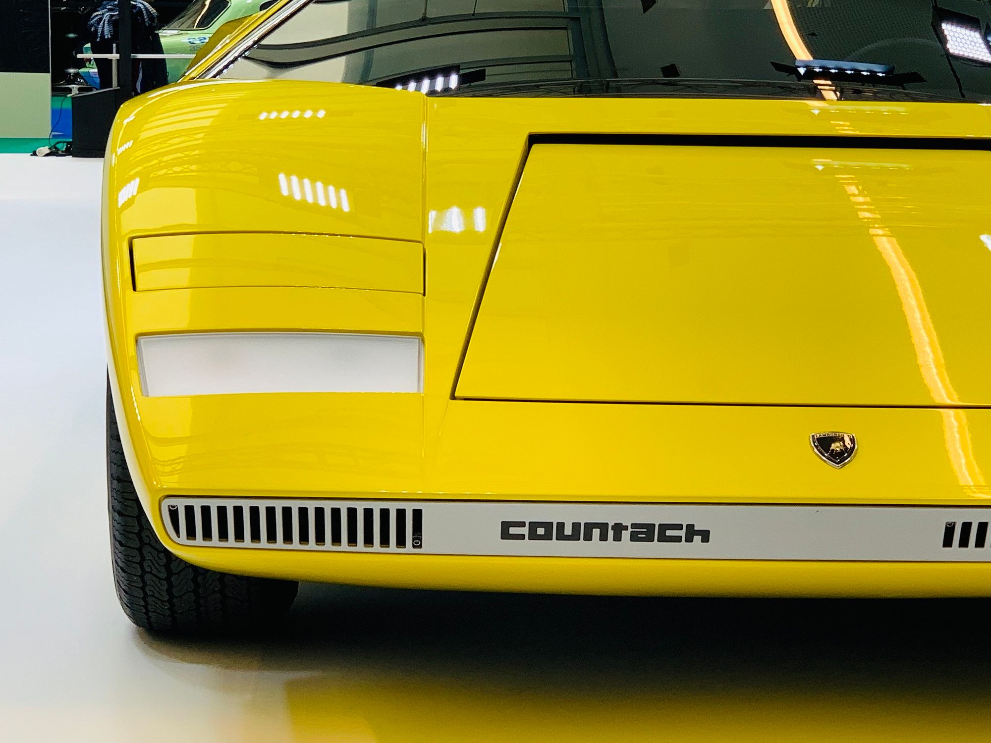
Something else I can’t quite put my finger on is the treatment of the front silver ‘bumper’. This might have to do with the more rounded LP400 nose, but I think the original is more crisp or pointy. Probably to do with the angle of the bodywork below this area.
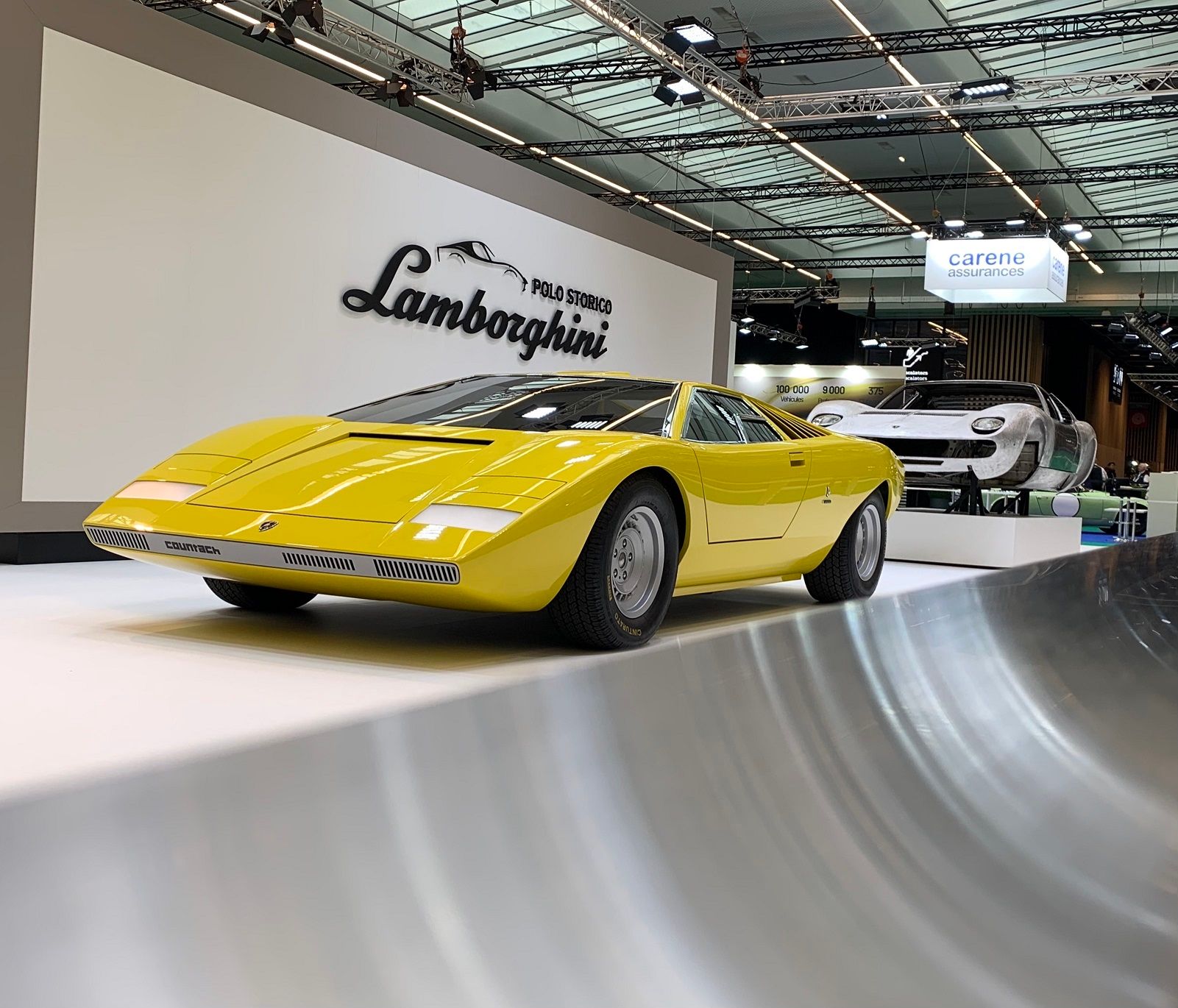
{Belgian Lamborghini enthusiast Simon Bal travelled from The Hague to Paris for Salon Retromobile just to see the Lamborghini LP 500 recreation. He was very happy to see the car that remains at the top of his list of the most beautiful cars of the 20th century, yet he was disappointed…he believes that the recreation is far from perfect…}
Comments
Sign in or become a deRivaz & Ives member to join the conversation.
Just enter your email below to get a log in link.
